My Creative Process

This is my very first logo that I came up with. There was too much going on in this picture, plus the plant to the left isn't actually my idea.
From there I went straight to color which is not a good idea. I should of put my idea into black and white first I probably would have come up with a better idea quicker, because if you can put your logo on a black background AND a white background, then you can make any color work.


This text ended up being very bland and everyone could pretty much sight what font it was. So, I came up with the next idea. Since I'm herbal and mineral remedies I need the pill to represent that it's medicine and the leaves to represent the herbal side of it.
I moved on to my next idea with the pill and leaf and made plenty of variations of it.


| I ended up picking something like this: | The graphic design teacher ultimately told me to start off in black and white so I redid it in black and white. |
|---|---|
 |
 |
She gave me tips on how to make it better and I ended up with this:


When I put it on a smaller scale (ex: on a shirt pocket) you can barely read the text if you can read it at all, so I changed my text, made it larger and easier to read.


Now once I've finished it in black and white I started adding color into it and this is what my logo ended up looking like with my emblem being just the pill.


After creating my logo we were asked to put it on a storefront, letterhead and stationary, design an app texture, design it on a billboard, and a business card.
The first thing I came up with was the business card:

Then the letter head and stationary:


Then the store front:

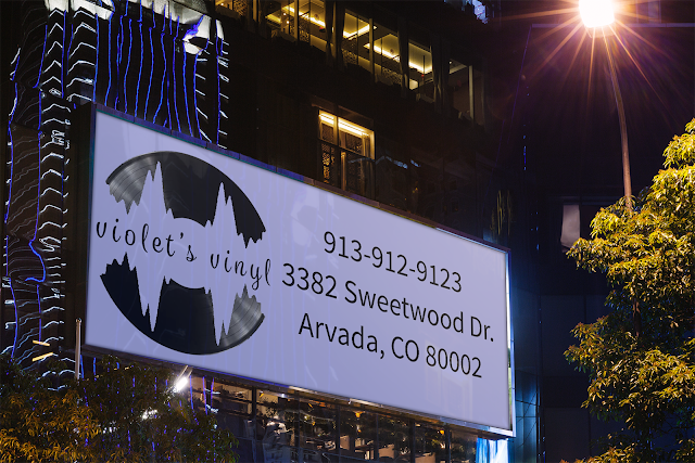
Then the app and billboard:

After I finished all this, I came up with a design for my webpage:


Comments
Post a Comment