Posts

Showing posts from September, 2017

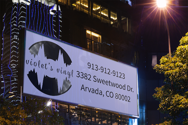
Violet's Vinyl Mock-ups

Image
My company's name is Violet's Vinyl. I designed my logo with a vinyl record with a lavender soundwave in the middle including the name is a curvy, handwritten font. With this logo I designed a billboard, letterhead, business cards, a storefront, t-shirt, and a phone icon.

Responsive Geo-Map

Image
The client wants a responsive geomap like Zillow, or Trulia, etc. This means that when you click on a pin on the map it shows the client's work and pictures. You can do this by creating your own custom map in google maps and embedding it into your website, which is the easiest way; or you can create custom code, which is the hardest way to complete this. Zillow Trulia

wordpress.com VS wordpress.org

Image
The biggest difference between wordpress.com and wordpress.org is who is hosting your site. On wordpress.org you host your own site by downloading your own software. It's completely free, it's more on your own. Wordpress.com is easy to set up, as you don't have to set up a hosting account; however, in the free version of wordpress.com you don't have very much freedom to customize, unless you pay for upgrades. When using wordpress.org you can use plugins and any theme you want, but you have to pay for your own hosting, setup wordpress yourself, and you have more responsibility because you are hosting your website, not someone else. 
Logo Ideas Explained

Image
I have created three different logos for the company Violet's Vinyl.  The first logo includes a complex record player with the name of the company. There is a lot going on in this image, and really isn't a logo because there is too much detail.  The second logo includes a sliver of a record and the name of the company written across it with a transparent grey background. This logo just doesn't look that nice and you can't really tell what it is because it so monotoned.      My third logo includes a record sleeve with part of the record sticking out. I have this in black and white and a purple/pink layover the record sleeve under the text. This may end up as an emblem, but I am not sure. This is my last logo, the one I am truly happy with. It isn't so simple, but it's not too complex.