Posts

Violet's Vinyl Mock-ups

Image
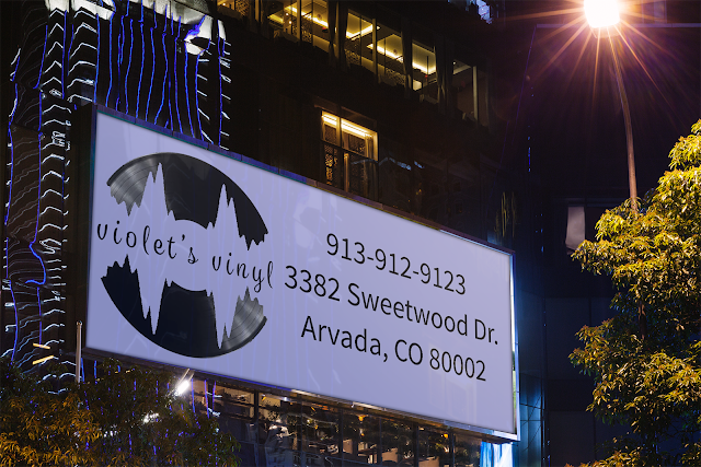
My company's name is Violet's Vinyl. I designed my logo with a vinyl record with a lavender soundwave in the middle including the name is a curvy, handwritten font. With this logo I designed a billboard, letterhead, business cards, a storefront, t-shirt, and a phone icon.

Responsive Geo-Map

Image
The client wants a responsive geomap like Zillow, or Trulia, etc. This means that when you click on a pin on the map it shows the client's work and pictures. You can do this by creating your own custom map in google maps and embedding it into your website, which is the easiest way; or you can create custom code, which is the hardest way to complete this. Zillow Trulia

wordpress.com VS wordpress.org

Image
The biggest difference between wordpress.com and wordpress.org is who is hosting your site. On wordpress.org you host your own site by downloading your own software. It's completely free, it's more on your own. Wordpress.com is easy to set up, as you don't have to set up a hosting account; however, in the free version of wordpress.com you don't have very much freedom to customize, unless you pay for upgrades. When using wordpress.org you can use plugins and any theme you want, but you have to pay for your own hosting, setup wordpress yourself, and you have more responsibility because you are hosting your website, not someone else. 

Logo Ideas Explained

Image
I have created three different logos for the company Violet's Vinyl.  The first logo includes a complex record player with the name of the company. There is a lot going on in this image, and really isn't a logo because there is too much detail.  The second logo includes a sliver of a record and the name of the company written across it with a transparent grey background. This logo just doesn't look that nice and you can't really tell what it is because it so monotoned.      My third logo includes a record sleeve with part of the record sticking out. I have this in black and white and a purple/pink layover the record sleeve under the text. This may end up as an emblem, but I am not sure. This is my last logo, the one I am truly happy with. It isn't so simple, but it's not too complex. 

Adobe Flash Player

What Flash made possible and its guarantees: At a time where the web was at its worst Adobe Flash Player created the possibility to add web-based video, animation, and interactivity, making websites more attractive. It guaranteed the content would look and behave the same way for anyone who loaded it, regardless of what type of browser or computer they were using.  Flash's performance regarding Apple, Facebook, and YouTube: In 2007 Apple decided not to support Flash in the newly introduced iPhone. Steve Jobs wrote on the Apple website in 2010 that the problem with Flash was that it was insecure and resource-intensive, and its plugin was overly proprietary. Jobs made the case for HTML5 and JavaScript, pointing out that they were based on open standards that web browser could build on. In spite of this Flash remained an integral part of the web. YouTube's video player was still built on Flash, along with Facebook's Farmville and Words with Friends. For YouTube HTML5...

My Creative Process

Image
This is my very first logo that I came up with. There was too much going on in this picture, plus the plant to the left isn't actually my idea. From there I went straight to color which is not a good idea. I should of put my idea into black and white first I probably would have come up with a better idea quicker, because if you can put your logo on a black background AND a white background, then you can make any color work. This text ended up being very bland and everyone could pretty much sight what font it was. So, I came up with the next idea. Since I'm herbal and mineral remedies I need the pill to represent that it's medicine and the leaves to represent the herbal side of it. I moved on to my next idea with the pill and leaf and made plenty of variations of it.  I ended up picking something like this: The graphic design teacher ultimately told me to start off in black and white so I redid it in black and white.            ...

Steal Like An Artist

The article Steal Like An Artist By Austin Kleon  is about using others ideas or creations and making the idea your own, but not just imitating it. Kleon states that nothing is original; he states that "All creative work builds on what came before. Nothing is completely original." He is saying that you can't get something from nothing. You have to get it from somewhere, so take others ideas and expand. Don't just simply copy an artist, steal what they have made and make it better, or different. Kleon quotes several artists in his book, but one that really stands out is by T. S. Eliot "Immature poets imitate; mature poets steal; bad poets deface what they take, and good poets make it into something better, or at least something different. The good poet welds his theft into a whole of feeling which is unique, utterly different from that from which it was torn." This means that when an artist "copies" another  artist, it is instantly apparent, this sh...